Dashboards
A dashboard is one screen that answers "how are we doing?" — without anybody having to open five things and do sums in their head first.
It's a canvas of tiles — charts, single big numbers, timelines, boards — each reading from your own data. Open tasks by status. Progress against a deadline. What's on this week. A counter's current value.
Whatever the person who keeps asking the question actually needs to see, so that they stop asking.
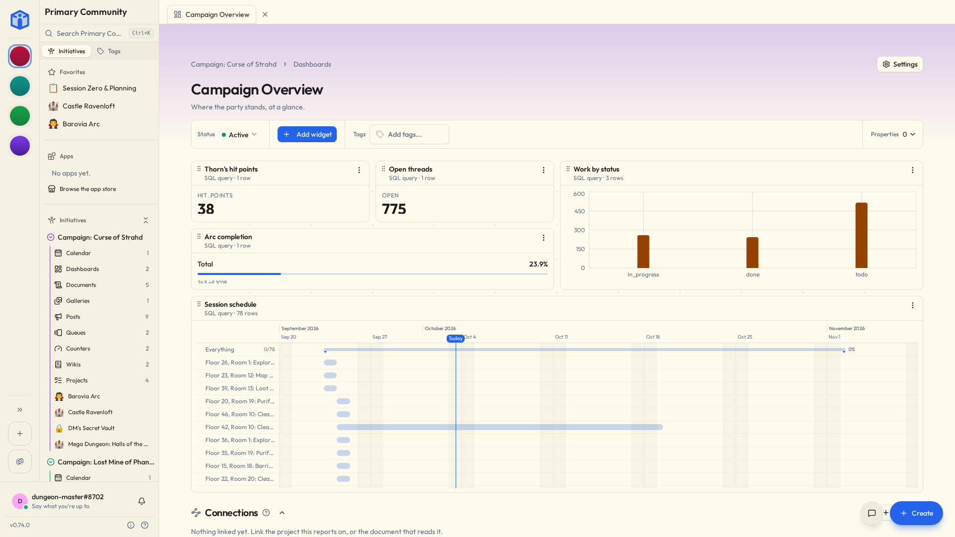
Dashboards only display
Nothing on a dashboard can be edited from it. That isn't a compromise we made — it's the entire point.
It means you can leave one running on a screen in the corner of the room, or send it to a board member, or hand a tablet to a volunteer, without the low background hum of anxiety that normally comes with handing somebody a live system.
The worst thing anyone can do to a dashboard is look at it.
Everyone sees their own version
Each tile shows you only what you're already allowed to see.
So two people can open the same dashboard and correctly see different numbers, and neither of them is looking at a bug.
The access rules you set on projects and files follow straight through into the reporting — which means a dashboard is never the accidental side door to something somebody wasn't supposed to see.
Run dashboard as
There is one case where that's wrong, and it's the case dashboards get built for: the number everybody in the room is supposed to be looking at. A total that's smaller for half the meeting isn't a total, it's an argument.
So under Settings → Details, Run dashboard as has two choices:
- Individual — the default. Everyone sees only what they can open, so numbers can differ from person to person.
- Initiative — everyone sees the same numbers, with full read access to the initiative, whatever their own permissions. Use it with care: people will see figures from things they can't open themselves.
Initiative is the dashboard's own access, not a person's. It doesn't change when whoever turned it on leaves or changes role, and it only ever reads — nothing on a dashboard can change your data.
Who may turn it on is a role permission, Run dashboards as Initiative, under Initiative settings → Roles. Managers always can. Changing the tiles of a dashboard that runs as Initiative takes the same permission, since the tiles decide what everybody sees; anyone else who can edit it can switch it back to Individual first.
Building one
From the initiative's Dashboards tab: New Dashboard. Add tiles, point each at what it should read, arrange them on the canvas. In the list, each dashboard's card is a small copy of it, so you can pick the right one by its shape.
Or skip the building entirely. Browse the marketplace, in the list's More actions menu — or beside Create Your First Dashboard while there are none — has ready-made dashboards you add in a couple of clicks and then adjust. See Plug-ins & the marketplace.
Usually faster than starting from a blank canvas, and often better, because somebody else has already spent a year discovering which four numbers actually matter and which nine just look impressive.
Steal a layout, then change it
A marketplace dashboard becomes an ordinary dashboard of yours the second you add it. Rename it, rearrange it, delete the tiles you don't like. Nothing phones home and nobody's feelings are hurt.
Pointing a tile at something
Two steps, and most people never leave the first.
Build is clicking. Pick what to read — tasks, files, queue items, notices, events, your community's own people — then which columns, what to group them by, and what to narrow it to. The dashboard writes the query for you.
SQL is the tab beside it, for the question clicking can't describe. It's real SQL, with the tables and columns offered as you type and the statement checked as you pause. One thing to know before you start: once you've edited the text, that tile stays in SQL. The builder can't read arbitrary SQL back, so it stops trying rather than quietly mangling what you wrote.
Either way you can reach what a thing is attached to without writing a join. Tasks by the person assigned, by their status, by their project — pick the related column and the rest is worked out.
Narrowing it
The Filters say which rows a tile is about. Pick a field, how to compare it, what to compare it against. With more than one, choose whether rows must match all of them or any, and add a group for the other kind when "high or urgent, and mine" is the actual question.
Archived work and templates are left out to start with. Archived and Templates above the filters each say Leave out, Include or Only — so "everything we archived this year" is one click away. Deleted things are never counted, on any dashboard, for anyone.
Dates are asked as distances rather than as dates. A tile set to the next 30 days still means that next month, which is the whole difference between a dashboard and a screenshot.
A tile that's about whoever's looking
Wherever a filter wants a person, one of the choices is Me.
That doesn't mean you. It means whoever is looking at the tile. Place My open tasks once and everybody who opens that dashboard sees theirs — one tile, not one per person, and nobody's name stored inside it.
(On a dashboard that runs as Initiative, Me is still whoever is looking — the tile counts across the whole initiative, then narrows to them.)
Grouping by time
Group a date by day, week, month, quarter or year and a chart labels each point that way — "Mar 2026", "Q1 2026" — in order, oldest first. A heatmap draws months and quarters as a row per year, and weeks and years as a single strip.
Boards
One of the tiles is a board: your tasks dealt into columns, and you say what a column stands for. A status. The people on the work, so everyone gets a column and you can see who is carrying what. Priority, project, tag — or one of your initiative's own properties, which is how you end up with a board columned by "Squad" or "Sprint" or whatever your group actually argues about.
A value that exists and has nothing in it still gets its column. An empty Blocked is information.
Like everything else here it only displays. There's nothing to drag a card onto — moving work between states is still a project's job.
Widgets from the marketplace
Some marketplace tiles are custom widgets. They run in an isolated sandbox and can only hand back something to draw — so a widget that misbehaves shows an error in its own tile while the rest of the page carries on as though nothing happened.
Where they show up
Dashboards live inside an initiative, next to its projects and files, and share the same way — Viewer, Editor, Owner, or the whole initiative. Everything else every tool has, they have too; see Tools. Since "look at this" is the entire use case, they're often the one thing a group opens right up.
Each dashboard has its own comment thread, which is an excellent place to argue about what a number actually means. Switch it off under Settings → Details if you'd rather that argument happened somewhere else.
Related
- Counters — numbers a dashboard can read.
- Plug-ins & the marketplace — ready-made dashboards.
- Sharing projects & files — access levels in full.
- Your space — every dashboard that's reached you, from every community.